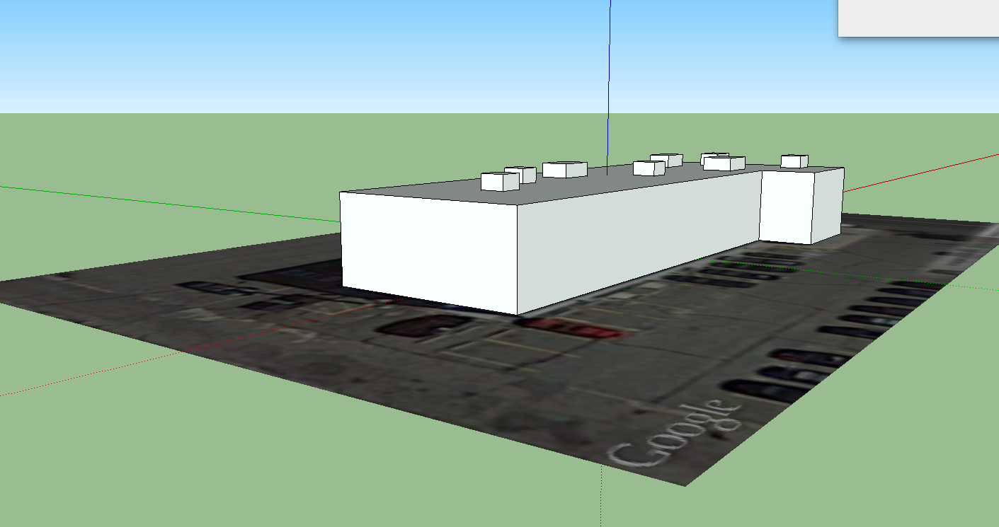
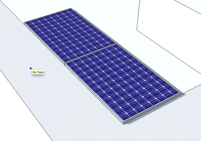
One thing to keep in mind with a solar installation are the local township laws related to solar.
As a general rule - you want to set yourself a border around the edge of the building where you don't put any solar. Sometimes the roof has a 'lip' that can cause shading -- or the township/building insurace/fire department has rules on how close to the edge you can get.
I'm going to add a 3' border to this demo with one of SketchUp's amazing tools - Offset.
Again we can just type in 3' while using the offset tool to get a border
Now Let's Add the Panels
*** As an added note - At this point you may want to group your entire building into one component or group -- that way nothing that you do to the panels will change the shape of the building ***
You may want to draw your own panels.... but before you do that, you might want to check to see if someone else has already drawn them.. and to scale...
Enter the 3d Warehouse
Many companies and SketchUp enthusiasts have actually uploaded to-scale renderings of specific models - so if you're designing with a specific panel in mind, you could try searching for that model specifically and you may just get it.
But I'm going to be a bit more general...
That'll do...
Once you select a model - it'll be dropped at random into your model.
It's hard to tell from this picture - but the panel is currently at a tilt and oriented the wrong direction for the building (remember you're going to want to orient as much to the south as possible - again - this is where a real solar installer can give you the EXACT preferred orientation- but generally you follow the angles of the building as best you can).
So we will need to use the rotate tool quite a bit now.
Since 3D drawing can mess with your perspective, I prefer to move to the edge of the building and use the building lines to rotate against.
First we can lock the edge of the panel to the edge of the building to remove the tilt
Then we can orient the panel so that it'll 'face' south
Now the border lines come in handy for laying out the solar
There are a number of reasons why you don't want to place a solar panel completely flat on a roof. For example, the panels have a small lip around the edges. When it rains, the moisture collects on the panel and then slowly evaporates, leaving behind dust and dirt. This can cut down on efficiency across the panels.
The amount you tilt the panels will depend on the racking you use and the actual location. For the purposes of this rendering, I'll use a 30 degree tilt.
Just like with placement, you can type in the degree of angle.
We plan to cover the roof though, and it's easier to work with the panels while they're flat - so let's undo the tilt for now
SketchUp has an amazing 'copy' tool - which you should use instead of the Ctrl-C.
Snag the corner of the panel with the move tool - and then hit 'Option' and you'll duplicate the panel exactly.
In order to replicate a typical racking system, you'll want to put an 1" of space between the panels.
One amazing thing about SketchUp is that it will remember your 1" spacing and automatically jump to that distance when you move future panels.
In the first tutorial I mentioned creating groups or components. As you can tell, the panel model that we imported from the warehouse is actually made of individual lines and planes - but it's been grouped together as one item for ease of use.
We'll do the same thing with this mini-array to populate more panels
We can now copy our little group and start making a longer row
Now we can group our long array - and just like duplicating panels, we can duplicate the row.
Spacing between rows of panels is a precise science - but for the purposes of this demo, we can follow our border line and give 6.5' of space.
Here is another cool SketchUp trick:
1. Grab the bottom corner of the array that is touching the border with the Move tool
2. Hit option to create a copy
3. Start moving the duplicated array backwards along the border and then enter 6.5'
4. Now enter 5x -- this will repeat the copy and move backwards 6.5' action five times
How. Amazing. Is. That.
Now you'll want to delete that last row... and now that your array is spaced out, you'll want to go through and adjust your array so it's a little better centered on the roof.
As you can see - a lot of the panels are merged into your HVAC units. We're going to want to go through and delete some panels.
First, you'll need to explode the groups of arrays that you made earlier so that you can delete individual panels
SketchUp allows you to 'hide' elements. You can 'hide' the tops on the HVAC units so that you can make sure to delete all panels being hidden within them. We used transparency earlier because we wanted to continue to work on and with the 2D building but in this case, we want the tops of the HVAC units to temporarily not exist and get in our way.
Once you've cleared out all the hidden panels you can batch 'unhide all'.
So now you have the max number of panels that you can physically fit on the roof (taking nothing else under consideration).
At this point I've forgotten how many I put on there... but there is a quick trick to get a count...
Click on one of the panels and select Entity Info
And it gives you a count of your panels
So now let's check out the actual layout and get ride of panels that are obviously going to be in shade.
Before
Aside from the obvious shading, you also want to be conscious of wire runs, string configuration and the cost of racking. There are a few places where you can set one individual panel by itself, but cost-wise, it's usually not worth it.
So now we have a new count -54 panels
So now you have a render that you can present to a client. With your tilt, panel type and count you can give them a rough calculation of how much power you can give them.
54 panels sounds like a lot - but even so, it probably won't cover the energy usage of the building. That's one of the reasons renderings are so important. You don't want to sell the client more than you can actually realistically build.
SketchUp is amazing.


